WEB DESIGN CASE STUDY
The study examines the redesign process for wayne.edu/students along with its goals, challenges and outcomes.
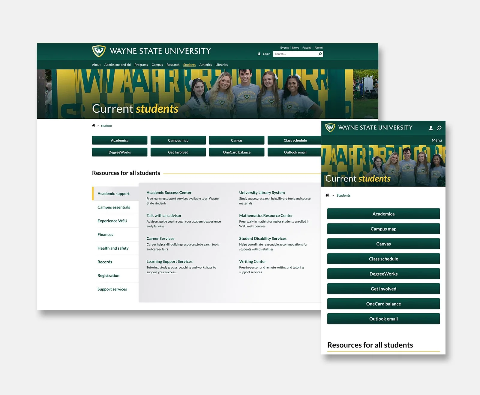
The problem
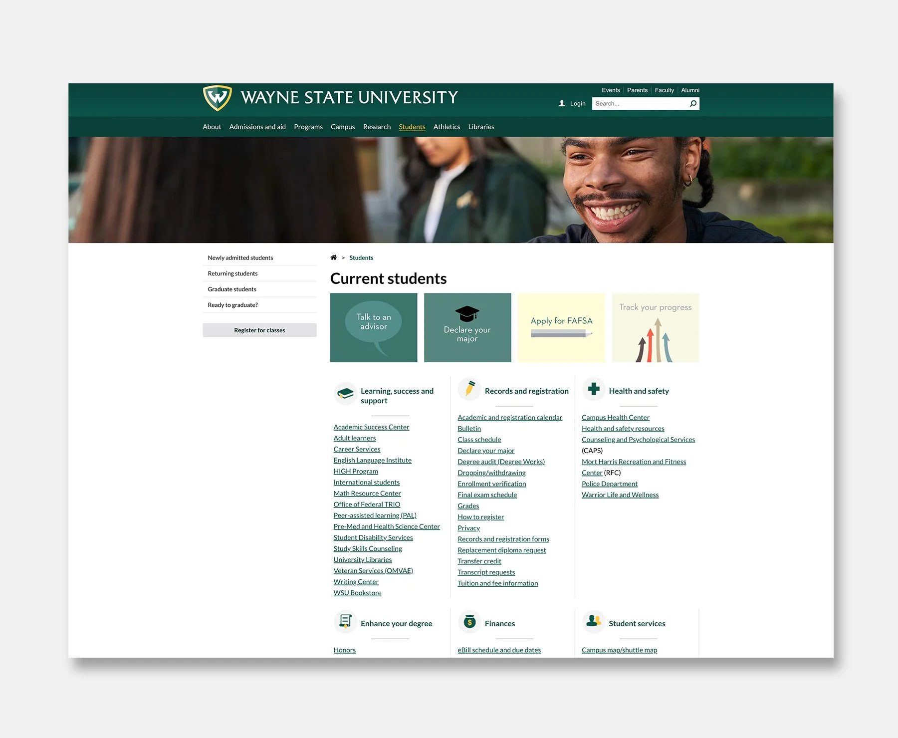
The decade-old layout for the current students page on wayne.edu was upgraded to address browsing efficiency and bring the most important content to its users more quickly and in fewer clicks. The previous layout consisted of a series of categorized lists of links to student resources with icons representing each category, and graphic calls to action. The outdated design made poor use of screen space and provided a lackluster graphic presentation.
The solution
The new design aims to provide a more logically and graphically organized approach to displaying content for users. This approach utilizes a tabbed component containing links to student resources. Additionally, graphic calls to action are replaced by styled buttons. The tabbed component replaces the categorized link lists with the aim of bringing the most important resources to the top of the page.
Heat maps documenting user behaviors while interacting with the previous layout vs the redesign are shown below.
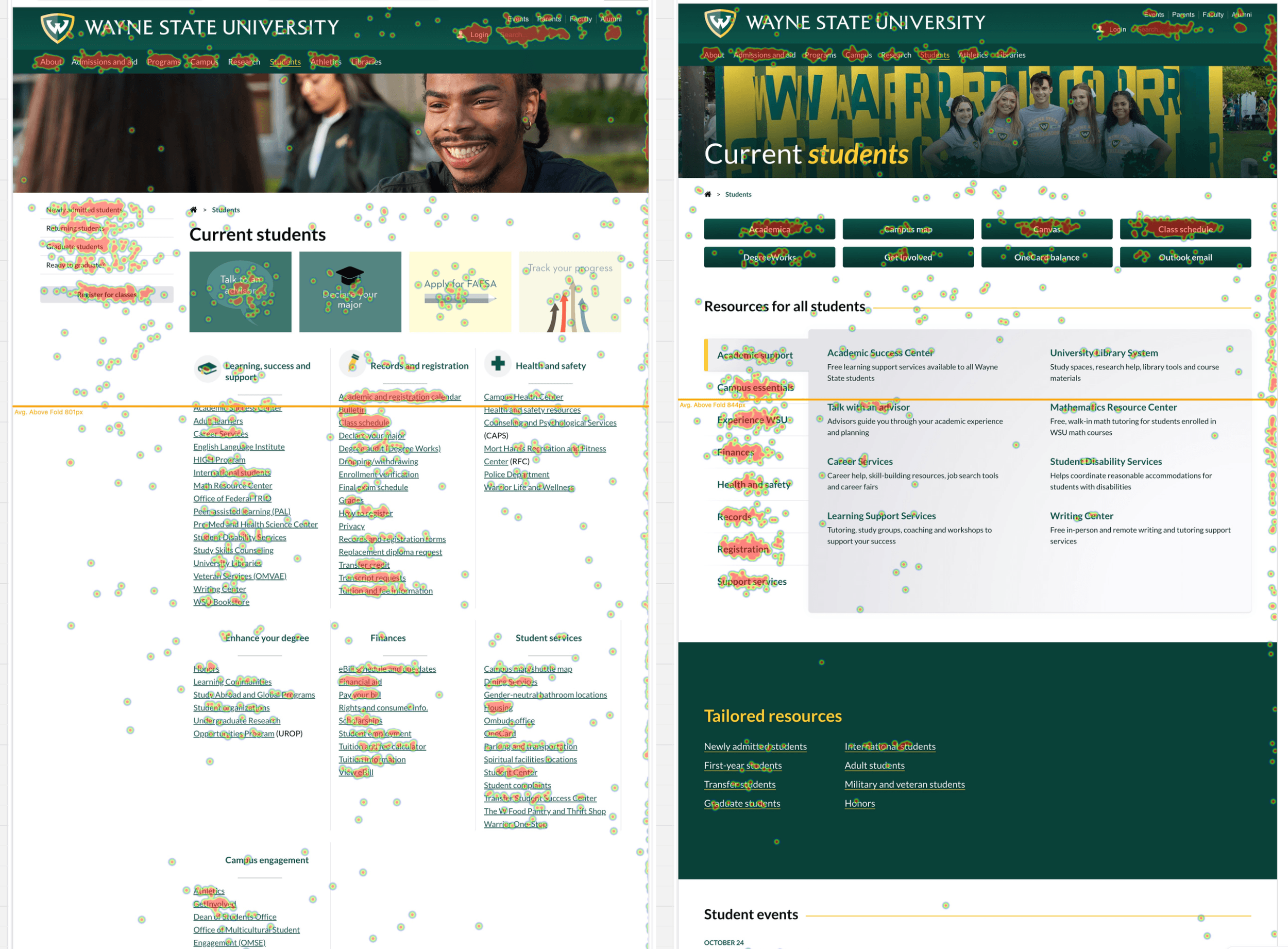
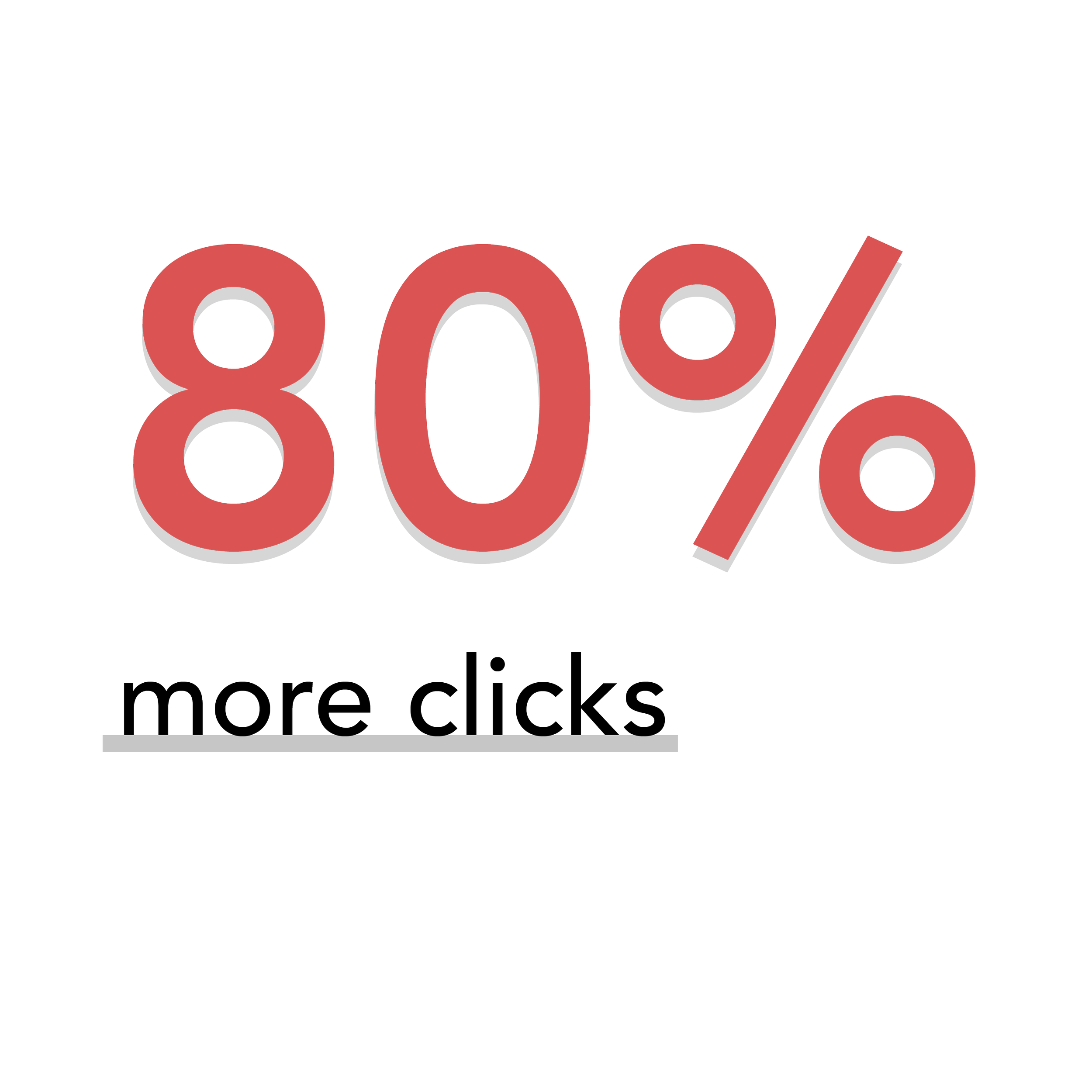
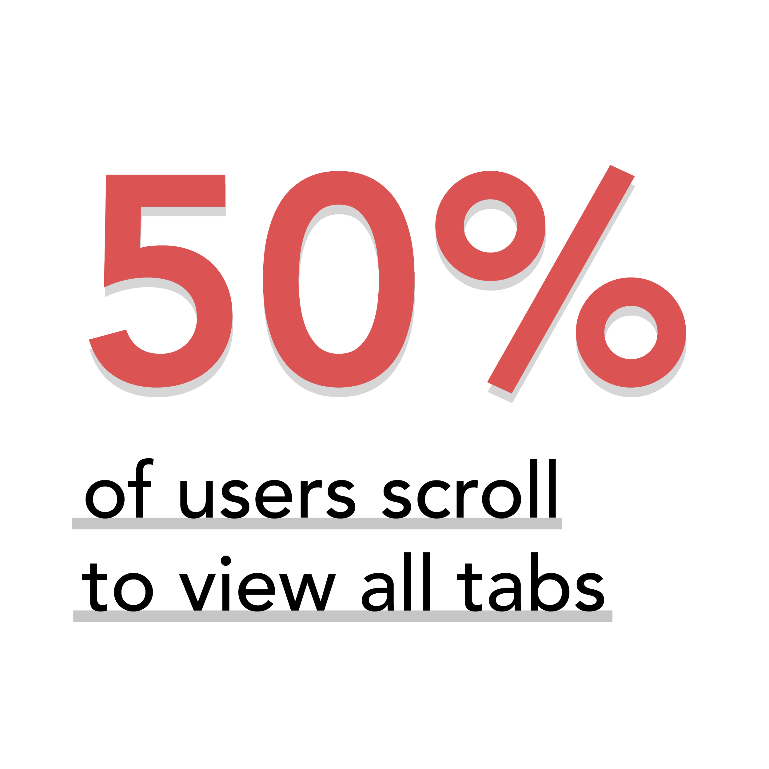
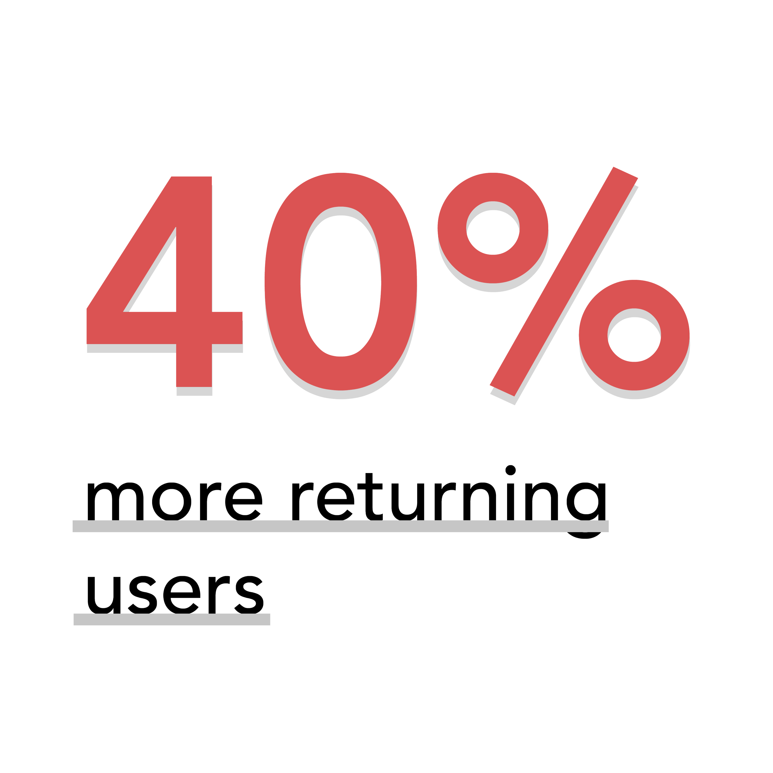
Project outcomes
User behaviors indicated that the redesign of the current students page layout was successful in achieving the goal of making most essential student resources more easily accessible. The analysis of these behaviors following the launch revealed several successful outcomes.